


![]()
This blog post will give a quick review of all the Q/A that were discussed in our Microsoft Data Analyst Associate Day 8 Live Session, which will help you to gain a better understanding and make it easier for you to learn the Microsoft Data Analyst, clear the [DA-100] Certification & get a better-paid job.
On Day 8, we also covered hands-on Lab 11 out of our 11 hands-on labs. We learned how to Create animated scatter charts, Use a visual to forecast values, Work with the decomposition tree visual, and Key Influencers Visuals.
On Day 7 Session, we covered an overview of Create a Dashboards and Paginated Reports in Power BI.
A week before, on Day 6 Session, we covered an overview of Optimize a Model for Performance in Power BI
> Introduction To Analytics
Analytics encompasses emerging industry practices like data mining, big data analytics, machine learning, AI, and predictive analytics.
- Analytics will transform raw data into an extensive collection of information that categorizes data into identifying and analyze behavioural data and patterns.
- Analytics can help with fraud detection, image recognition, sentiment analysis, overall general employee productivity, and it also often replaces cumbersome manual processes.
> Statistical functions
Statistics Explains the distribution of the data, helps identify the key takeaways and trends, and determines whether outliers exist. The statistical function is the information that provides a simple and quick description of your data.
Power BI has many functions that help in conducting statistical analysis, such as Data Analysis Expressions (DAX) functions, visuals such as Bell curves and Histogram, advanced analytics visuals, and statistical programming languages such as Python and R.
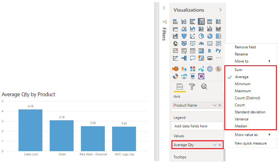
- PowerBI Desktop has a number of DAX functions that you can use to get quick statistics based on your data.
- To avoid performance issues, it’s better to create the statistical measures yourself by using DAX functions to calculate the average, min, sum, max, and so on.
- To can access any of the statistical methods as shown below image.
Also Read: Our blog post on Power bi Service.
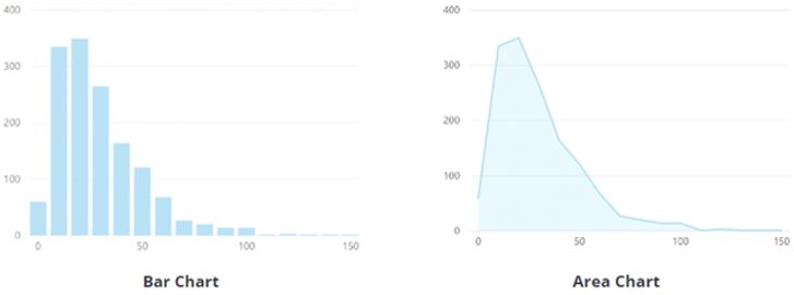
> Histogram
- Histograms and bell curves are the most common way to display statistics about your datasets.
- In PowerBI terms, you can represent a histogram with one of the column chart or bar chart visuals and can represent a bell curve with an area chart visual, as shown in the following image.
- You can use the Q&A visual to ask a direct question about the Bottom or top items in a list.
- Power BI’s typical bar or column chart visual relates two data points: a Dimension and a measure. A histogram differs from a standard bar chart in that it only visualizes a single data point.
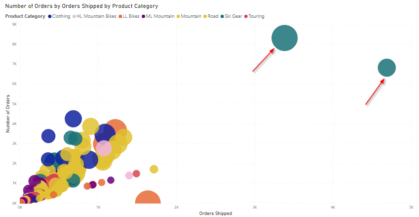
> Identify Outliers from Power BI visuals
Outliers are the type of anomaly in your data, something that you did not expect or that surprises you, based on historical averages or results.
- To identify outliers, we have to isolate the data points that significantly differ from other data points and then take action to investigate the reasons for the differences.
- Power BI allows you to identify outliers in your data, but you need to first determine the logic behind what constitutes an outlier.
- The process of identifying outliers involves segmenting the data into two groups: one of the groups is the outlier data, and the other is not.
- To identify the outliers, use a DAX formula or visualization because these methods will ensure that your results are dynamic.
- The best visual to use for identifying outliers is the scatter chart, which shows the relationship between two numerical values, and also scatter charts display patterns in large sets of data and is, therefore, ideal for displaying outliers.
- The below image is an example of finding outliers using Power BI Visuals.
Read More: About Power bi Filter.
> Group Data for Analysis
When you create visuals, PowerBI Desktop aggregates your data into groups based on its values in the underlying data. You can also refine how those default groups are presented. Also, we can create new groups by grouping two or more data points in a visual.
- Grouping features are used to ensure that the visuals in your reports display your data according to your preference.
- Using these features will help you to clearly view, analyze, and explore the data and trends in your visuals. Also, you’ll be able to identify clusters, patterns of behaviour, data averages, and more.
- To create the group, use Ctrl + click to select the data points on the visual that you want to group.
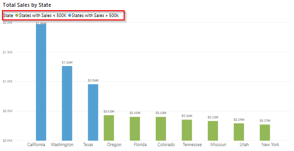
- The following image shows a bar chart in which PowerBI has automatically segmented the data in the way that it found most useful: Total Sales by State.
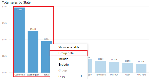
- After Creating a group, notice that the visual updates take into account the new group.
- The following image shows that the other states, which are the states with lower sales (less than 500,000 dollars), have been grouped together and highlighted differently.
Check Out: Our blog post on Power bi KPI.
> Clustering Techniques
Clustering allows you to identify the segment (cluster) of data that is similar to each other but dissimilar to the rest of the data. Clustering is different from grouping.
- The PowerBI clustering feature allows you to quickly find the groups of similar data points in the subset of your data.
- It analyzes your dataset to identify dissimilarities and similarities in the attribute values, and then it separates the similar data into the subset of the data and these subsets of data are referred to as clusters.
- On the Cluster window that displays, you can edit the default field, name, and description, if required.
- The following image shows that the Number of clusters box is blank by default, which means that Power BI automatically finds the number of clusters that it determines as making the most sense with your data.

- PowerBI will run the clustering algorithm and create a new categorical field with the different cluster groups in it.
- when you look at the visuals, you can clearly see the clusters in your data and perform analysis on them.
- The new cluster field is added into your scatter chart legend field well bucket, which you can use as a source of cross-highlighting like any other Legend field.

> Time Series Analysis
Time series analysis involves analyzing the series of data in time order to identify meaningful information and make predictions and trends. The results of time series analysis are the best data that you use for forecasting activities.
- Time series analysis involves the use of visuals such as project planning, Gantt charts, and stock movement datasets.
- In PowerBI, we can use visuals to view how the data is progressing over time, which in turn allows us to make observations, such as if any major events disrupted our data.
- To conduct the time series analysis in PowerBI, we need to use the visualization type that is suitable for displaying the trends and changes over time, such as an area chart, line chart or scatter chart.
- The following image is an example of visual animation of Time Series Analysis, which can be used in PowerBI.

Source: Microsoft
Check Out: What is Power Query?
> Analyze Feature
- The Analyze feature provides you with the additional analysis that Power BI generates for a selected data point.
- Power BI provides you with this feature to have a different insight into your data.
- This feature helps you to analyze why your data distribution looks the way that it does.

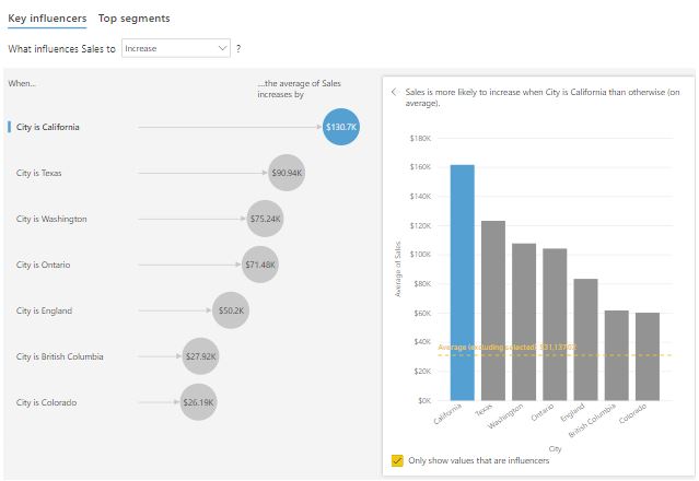
- Explain the increase and Find where the distribution is different. The options that are available will depend on the data point that you selected.
- The following image is an example if you select the Explain the increase option and a window displays with a new visual

> Key Influencers Visual
- The Key influencers visual helps you understand the factors that are affecting a specific metric. It analyzes your data, ranks the factors that matter, and then displays them as key influencers.
- The visual also helps you contrast the relative importance of these factors, which means you can build your visuals while understanding what factors impact those visuals and why they appear the way they do.
- The following image is an example of a key Influencers Visual.
Q/A asked during the session
Q1. Which visualization function is used for a statistical summary?
A.Histograms and bell curves are the most common way to display statistics about your datasets.
Q2. What visuals are used for finding outliers?
A.The best visual to use for identifying outliers is the scatter chart, which shows the relationship between two numerical values.
Q3. How does Binning differ from grouping?
A.Grouping is used for categories of data. Binning is similar to grouping, but it is used for grouping continuous fields, such as numbers and dates.
Q4. What is the Clustering technique?
A.Clustering allows you to identify a segment (cluster) of data that is similar to each other but dissimilar to the rest of the data.
Q5. Where is time series analysis often used?
A. Time series analysis is the best data that you can use for forecasting activities.
Q6. Where are time series charts located?
A. Time series charts can be imported from AppSource.
Q7. What is the use of the Analyze feature?
A.The Analyze feature provides you with additional analysis that Power BI generates for a selected data point.
You might want to use this feature to determine if Power BI has found something that you haven’t seen before or if you want Power BI to give you a different insight into your data.
Q8. What is the use of the AI insight feature?
A.The AI Insights feature allows you to connect to a collection of pre-trained machine learning models that you can apply to your data to enhance your data preparation efforts.
Q9. What is the use of Decomposition Tree visuals?
A.The Decomposition Tree visual automatically aggregates your data and lets you drill down into your dimensions so that you can view your data across multiple dimensions.
Because the Decomposition Tree is an AI visual, you can use it for improvised exploration and conducting root cause analysis.
Quiz Time (Sample Exam Questions)
With our Microsoft Data Analyst Associate, we cover Over 100+ Sample questions to help you prepare for the Certification [DA-100]
Check out these Questions:
B. False
Comment your answer in the comment box.
References
- Microsoft Certified Data Analyst Associate [DA100]: Everything You Need To Know
- Microsoft Certified Data Analyst Associate [DA100] Step By Step Activity Guides (Hands-On Labs)
- Introduction to Microsoft Power BI Platform
- [DA-100 Day 3 Q/A Review] Work With Tables, Data Modeling, Data Granularity In Power BI
- [DA-100 Day 4 Q/A Review] Create Calculated Columns, Use DAX to Build Measures In Power BI
Next Steps to begin with DA100 Certification:
Our Microsoft Data Analyst Associate Training Program will cover all the exam objectives, 11 Hands-On Labs, and practice tests if you want to begin your journey towards becoming a Microsoft Certified: Data Analyst Associate [DA-100] by checking our FREE CLASS.


![AWS DevOps [DOP-C02] Professional Step By Step Activity Guides (Hands-On Labs)](https://k21academy.com/wp-content/uploads/2023/02/DOP-C02-1.png)