


![]()
A business needs to analyze its goals for better growth and development. Power BI KPI helps a business determine the time-based goals and targets. This blog will show you the need for KPI and steps to follow for creating them in Power BI with the following covered topics.
What is KPI?
KPI or Key Performance Indicators helps in determining the amount of progress made towards a goal. It helps a business keep an eye on the overall growth and performance using certain parameters that focus on a particular result. In simple words, KPI indicates the current performance of a business to complete a target.
KPI is focused on two main queries.
- What am I ahead or behind on?
- How far ahead or behind?
See Also: Data Analysis in Power BI
Get Familiar With Power BI
Before creating Key Performance Indicators, let’s look at Power BI and the components we will be using. It will be helpful, especially for beginners who are not much familiar with Power BI.
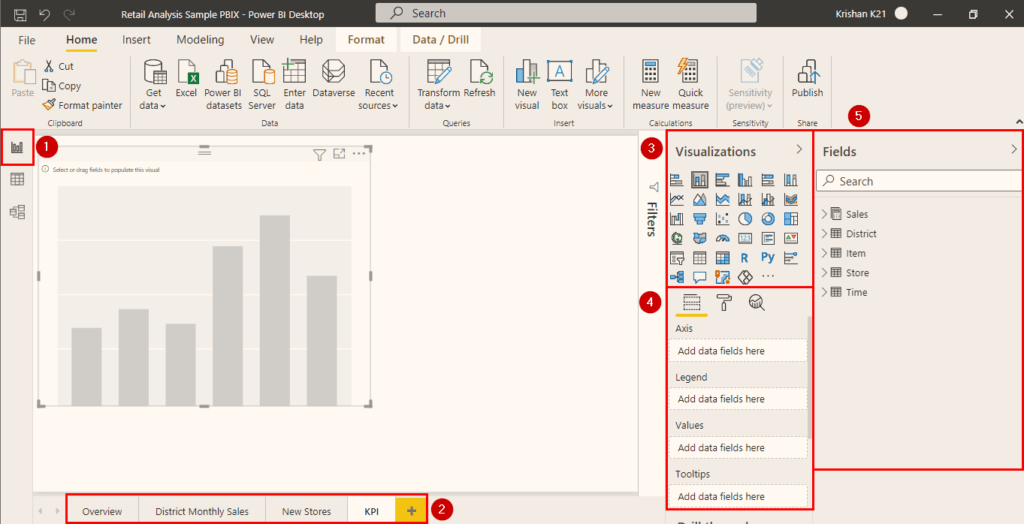
- On the extreme left sidebar of Power BI Desktop, three buttons are available. Visit the first ‘Reports‘ tab. This tab contains all the visualizations and reports.
- On the bottom, ‘Pages‘ are present. To add another page, click on the plus icon.
- The top right sidebar contains various visualization charts. To use them, click or drag them to the space present at the center of the Power BI tool.
- The bottom right space contains the properties of the visualization window. Here, the appearance, style, and values of the visualization are managed.
- The extreme right space is for ‘Fields‘ containing all the data and tables imported in the project.
Import Data
After getting familiar with Power BI, we need some data to start creating Power BI KPI. I will be using the sample data provided by Microsoft, but you can also use your own excel data. To download the Retail Analysis Sample data by Microsoft, visit the link here.
See Also: Data Modeling in Power BI
How to Create KPI in Power BI?
We can create a basic Power BI KPI for some data with a few steps. I will use the above Retail Analysis Sample for measuring the previous and this year’s revenue with the help of KPI. After importing the data in Power BI, follow the below steps.
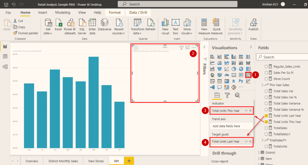
Step 1) Click or drag the KPI visualization from the visualization window as shown in the above image.
Step 2) After clicking the KPI visual, an empty window of the visualization is created. Then, you can resize and drag the visual wherever you want.
Step 3) Now, search for the Total Units This Year field present under the Sales table in the ‘Fields‘ section. Click and drag it to the top ‘Indicator‘ field. It controls the indicator’s display unit, and its value will be used to display the current progress.
Step 4) Similarly, look for the Total Units Last Year field present in the ‘Fields’ section under the Sales table. Place it in the ‘Target Goal’ field. This is the aim of the KPI, and the values present in it will be used for calculating the goal after comparing it with the Indicator field.
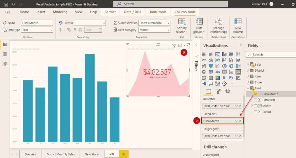
Step 5) Now, search the Fiscal Month field inside the Time table in the ‘Fields‘ section. Then, click and drag it to the ‘Trend Axis‘ field. The KPI visual shows the trend axis as the background.
Step 6) After completing the above steps, you will see your Power BI KPI visual updated with a graph and some values. The amount present at the center of the visual is the goal that needs to be reached. The percentile value that is left to reach the target is mentioned below the goal amount.
Manage Your Power BI KPI
Once the Power BI KPI is created, you can manage it and change its appearance with additional settings present in Power BI. See the below steps to manage your KPI.
Step 1) Copy the previously created visual by pressing Ctrl with C and paste it. This will help to distinguish the previously created visual and new visual with changes in appearance and settings.
Step 2) To manage any visual appearance, you need to visit this roller paint icon as shown in the above image. There are various options, but we will test a few. Do remember, the options and settings present inside it vary with a different visualization.
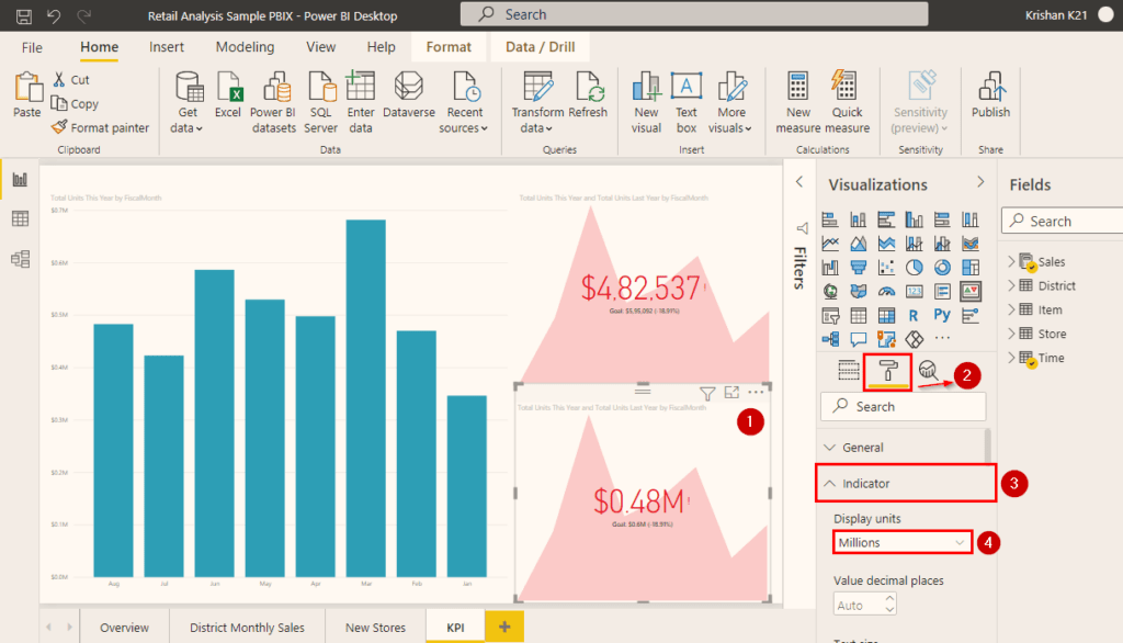
Step 3) Suppose I want to change the currency units of the KPI visual, then I will search for the Indicator settings.
Step 4) Click on the Display Units dropdown field and change the unit you want to pick. Here, I changed the dollar unit to a million-dollar unit.
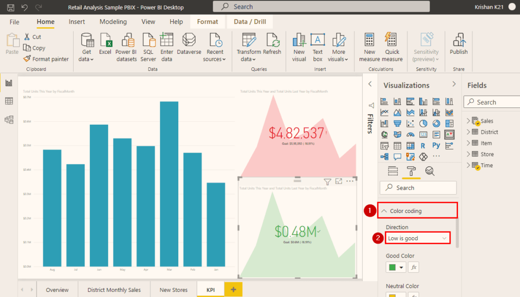
Step 6) The previous KPI visual works for the scenario where the aim is to get maximum revenue. But, suppose the same graph is for the expenditure, and we want the KPI to treat less amount to be the best case. So, the color grading option is used, as shown in the above image.
Step 7) Click on the Direction drop-down field and click on the Low is Good option. This will ask the KPI to change the visual color to green if the amount is less than expected.
Similarly, you can manage your Power BI KPI visual settings and appearance by tweaking the various options available in Power BI.
Conclusion
Key Performance Indicators in Power BI measures performance. It helps data analysts to create, record, and maintain the target for a business. From this blog, you have learned the overview of Key Performance Indicators and how to create them in Power BI.
This blog only covered the basics of Power BI KPI. If you want to get more insights on Power BI and become a data analyst, check our Microsoft Certified Power BI Data Analyst Associate Certification course.
References
- Introduction to Microsoft Power BI Platform | Everything You Must Know
- Exam PL-300: Microsoft Power BI Data Analyst | A Replacement Of DA-100
- Microsoft Certified Data Analyst Associate [PL-300] Step By Step Activity Guides (Hands-On Labs)
- Case Study: Display Live Data Streaming Using Power BI Service
- Introduction to Data Modeling in Power BI
- What is Power Query | Microsoft Azure Power BI Tool
Next Steps to begin with PL-300 Certification:
In our PL-300 Certification Training Program, we’ll cover 10+ Hands-On Labs. If you wish to start your journey towards becoming a Microsoft Certified: Power BI Data Analyst Associate, try our FREE CLASS.


![AWS DevOps [DOP-C02] Professional Step By Step Activity Guides (Hands-On Labs)](https://k21academy.com/wp-content/uploads/2023/02/DOP-C02-1.png)


