


![]()
In this blog, we will cover some quick tips, including QnA and important topics that we covered in the Microsoft Data Analyst Associate Day 5 Live Session, which will help you to gain a better understanding and make it easier for you to
In Day 4 Session, we covered an overview of .
A Week before, In Day 3 Session, we covered the Design of a Data Model in Power BI.
- Power BI visuals are attractive charts and graphics that you can use to revitalize your data.
- Visuals allow you to share the data insights more effectively and increase comprehension, retention, and appeal.
- Visuals are a fundamental part of your report because they help your report audience connect and interact with the information to make informed decisions quickly.
- After you’ve loaded and modeled your organization’s data in Power BI Desktop, you will be ready to start creating your reports.

Also Check: Our blog post on Power Bi GateWay.
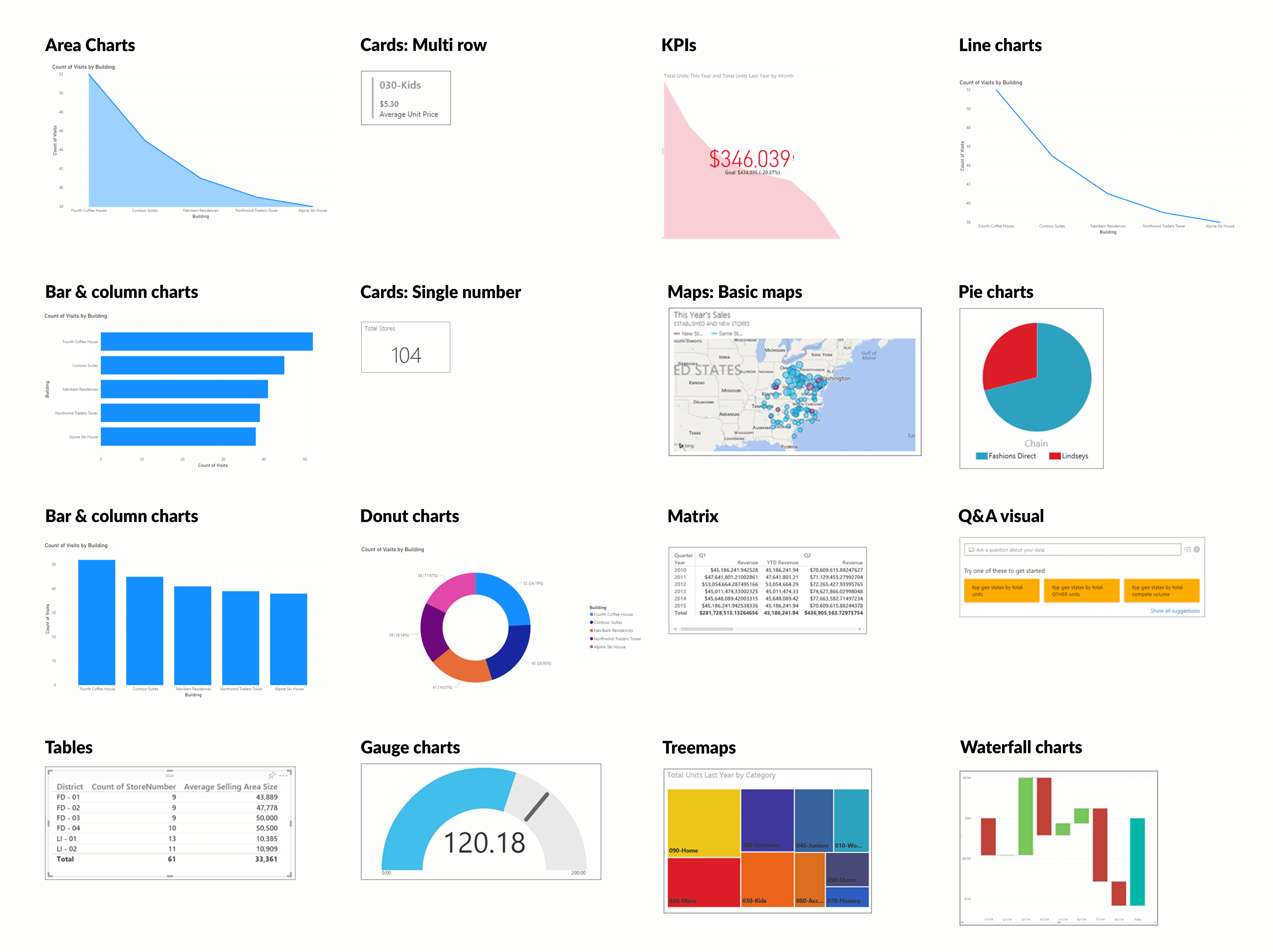
> Choose An Effective Visualization
Power BI Desktop offers a range of out-of-the-box visualization options that are available directly from the Visualizations pane.
1) Table and Matrix Visualization:
- These visualizations show the relationship of parts to the whole by dividing the data into segments.
- The pie chart is a solid circle.
- The donut chart has a blank center and allows space for a label or an icon Treemap visualizes a large amount of hierarchical data as a bar chart can’t handle it effectively. It spots patterns, outliers, and exceptions.
- Compare multiple measures with different value ranges
- Show the correlation between two measures in one visual
- Conserve space on your report page
Also Check: Our blog post on Power bi KPI.
> Import A Custom Visuals
- In addition to the out-of-the-box visualizations in Power BI Desktop, hundreds of other developers have created many visuals for you to choose from.
- If you have any specific visuals in mind, you can likely find them in the marketplace. If you can’t find it, Power BI makes it possible for you to build your own.
- These custom visuals available in Microsoft AppSource are created by Microsoft and Microsoft partners, some are certified, and some are not.
- In the Visualizations pane, select the Get more visuals icon and then select Get more visuals. On the window that displays, locate and select the visual that you want to import and then select Add

Also Check: Our blog post on Power bi Developer.
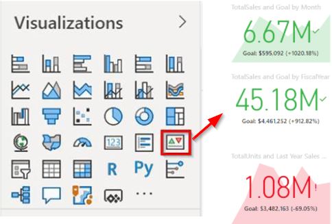
> Work With Key Performance Indicators
Key performance indicators (KPIs) are excellent in helping you track progress toward a specific goal over time. To use a KPI, you need three pieces of information:
- You want to track a unit of measurement, for instance, total sales, the number of employee hires, the number of loans serviced, or the number of students enrolled.
- A goal for the measurement so that you can compare your progress with that goal.
- A time series, for instance, daily, monthly, or yearly.
Also Check: SSRS vs Power bi, Know their major differences!
> Create A Data-Driven Story
- Organizations use reports to monitor and record performance and identify trends and variances. When an organization is making decisions, it relies on the information that is provided by reports.
- After you’ve added visuals to your report, you can make further improvements and modify the report before finally sharing it with the report audience.
- We can apply the available functions in the report editor in Power BI Desktop to your visuals, which will transform our report into a data-driven story
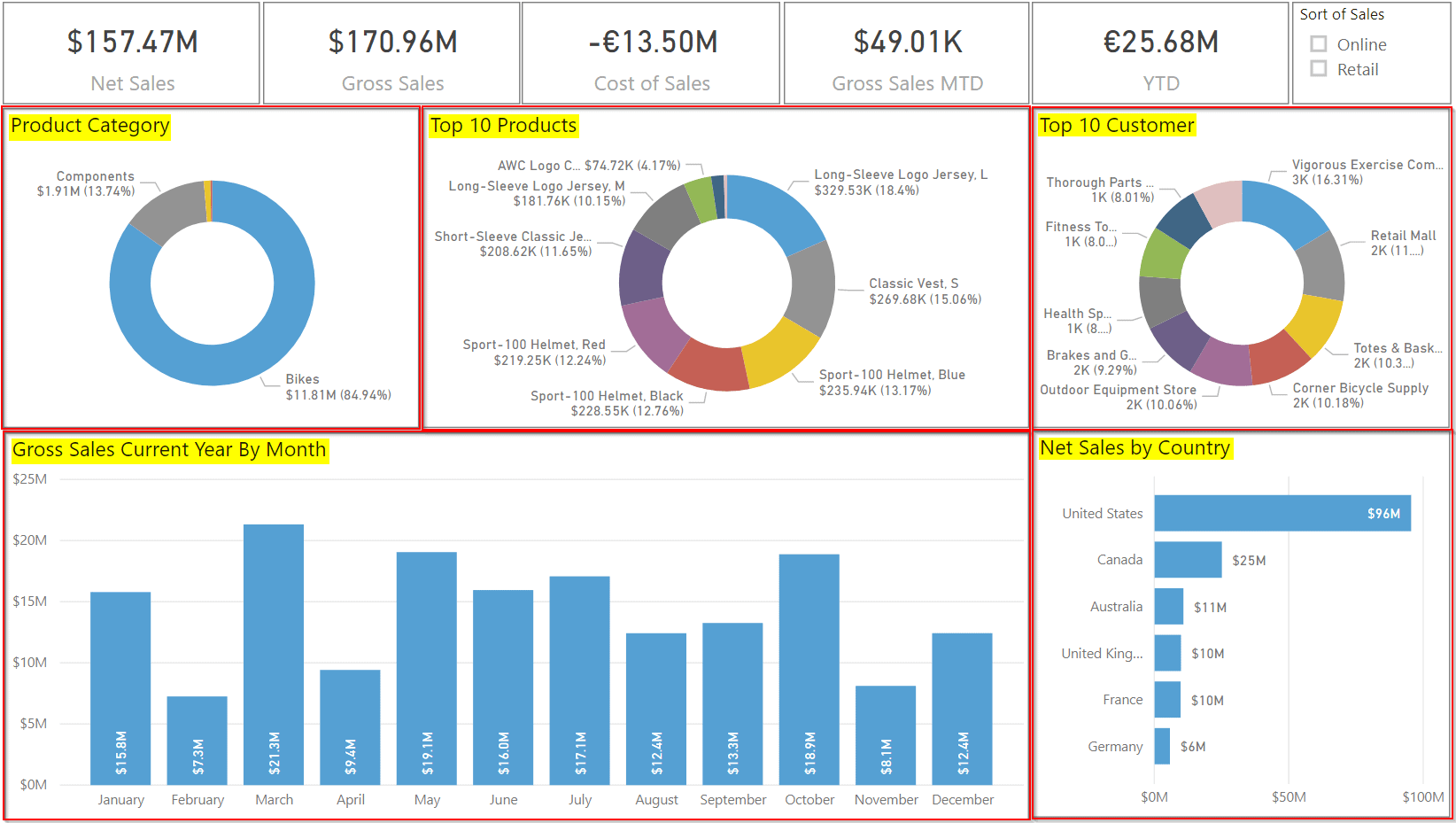
> Design A Report Layout
The page layout of the reports you create in Power BI Desktop will likely depend on the business requirements, the context of the underlying data, and the output requirements.
Key guidelines for creating a well-designed report layout include:
- Sketch your report layout. This approach will help you get an idea of what it will look like before you spend considerable time physically designing it.
- You could draw multiple sketches to try out different ideas and then discuss these ideas with your team to select the best layout design.
- Focus on the most important information. Highlight key parts of your report with the bright color or summary icon so that it stands out and draws users to the most critical metrics.
- Select the right background for the context of your report.
- A white background can make your report look clean and professional, whereas a black background can draw attention to colorful highlights on the report.
- Using images as a background can add visual interest.
- The below image is an example of a model report Design.
Also Check: Our blog post on App Power bi.
> Slicer
A slicer is a filter that you can add to your report so that users can segment the data in the report by a specific value, such as by year or geographical location.
A slicer can be used to:
- Provide quick access to commonly used or important filters.
- Simplify a user’s ability to see the currently filtered state without having to open a drop-down list.
- Filter by columns that are unneeded and hidden in the data tables.
- Create more focused reports (by putting slicers next to important visuals).
- Defer queries to the data model by using a drop-down slicer, particularly when you are using DirectQuery.
Slicers are not supported for input fields and drill-down functions

Also Check: What is the difference between MSBI and Power bi.
> Sort Data
Sorting helps you display the most important data in the most logical way, such as in alphabetical or numeric order. This basic feature can help when you are making significant business decisions.
There are Three sorting options:
- Sort descending – Sorts the visual by the selected column in the greatest value to the smallest value.
- Sort ascending – Sorts the visual by the selected column in the smallest value to the greatest value.
- Sort by – Sorts the data by a specific column. Hover over this option to display the list of columns that you can select from.
- The below image is of Sorting the data.

Q/A asked during the session
Q1. What are the types of Visualization?
A: The Types of Visualization are as follows:
- Bar and column charts
- Line and area charts
- Pie chart, donut chart, and Treemaps
- Combo charts
- Card visualization
- Funnel visualization
- Gauge chart
- Waterfall visualization
- Scatter chart
- Scatter chart
- Q&A visualization
Q2. What are the core components that consist of the Q&A visualization?
A: The Q&A visualization consists of the following four core components:
- The question box, where users enter the question and are shown suggestions to help them complete the question.
- A pre-populated list of suggested questions.
- An icon that users can select to convert the Q&A visual into a standard visual.
- When entering natural language queries with Power BI Q&A, you can specify the visual type in your query. An icon that users can select to open Q&A tooling allows designers to configure the underlying natural language engine. The following example illustrates how to implement Net sales by country.
Q3. What is a Bookmark? And what are the elements saved when you create a bookmark?
A: Bookmark is a feature in the Power BI desktop that captures the currently configured view of a report page that allows the users to return to that view later whenever needed quickly.
The elements saved when creating a bookmark are as follows:
- Current page
- Filters
- Slicers that include slicer type and slicer state
- Visual selection state (such as cross-highlight filters)
- Drill location
- Sort order
- Visibility of an object (by utilizing the Selection pane)
- Spotlight or Focus modes of any visible object
Q4. What is the unique benefit of using a customized tooltip?
A: It can demonstrate the images, visuals, and any other collection of items created by the user on the report page.
A: A flexible and powerful new tool under the Power BI umbrella, Power BI Designer empowers users to create intuitive dashboards and reports quickly and easily. It also lets the users change the visual views of the data at their fingertips for informed decision-making and better decision-making analytics. This designer is the host of drop-and-drag capabilities that helps the user place content where they want it on the report canvas in the well-structured layout.
Q6. How can you analyze the performance of each of your report elements?
A: By using a performance analyzer to analyze each of the report elements.
Q7.why are slicers, filters, and sorting used?
A: Slicers, filters, and sorting are used to edit and configure interactions between the visualizations that you add to your report
Quiz Time (Sample Exam Questions)
With our Microsoft Data Analyst Associate, we cover Over 100+ Sample questions to help you prepare for the Certification [DA-100]
Check out these Questions:
A. When there are at least 4 stages, and data flows among them sequentially
B. To show the beginning and ending headcount for the organization in a year
C. To calculate a possible outcome like revenue, sales, deals, etc. by stages
D. To know the factors influencing a key metric. For example, what was the reason behind the highest sale in November 2020?
E. To reveal bottlenecks in a linear process.
F. To compare several measures with different value ranges
Comment your answer in the comment box.
References
- Microsoft Certified Data Analyst Associate [DA100]: Everything You Need To Know
- Microsoft Certified Data Analyst Associate [DA100] Step By Step Activity Guides (Hands-On Labs)
- How to Design a Report in Power BI Desktop
Next Steps to begin with DA100 Certification:
In our Microsoft Data Analyst Associate[DA-100] Certification Training Program, we will cover 11 Hands-On Labs. If you want to start your journey towards becoming a Microsoft Data Analyst Associate[DA-100], try our FREE CLASS.


![AWS DevOps [DOP-C02] Professional Step By Step Activity Guides (Hands-On Labs)](https://k21academy.com/wp-content/uploads/2023/02/DOP-C02-1.png)


