


![]()
This blog will cover the Q&As of Python for Data Science (AI/ML) and Data Engineer Training covering NumPy, Pandas and Matplotlib in Python Q & A: Day 7 Live Session Review. This blog will help to clear your concepts in Python.
We also covered hands-on Lab 21, Lab 22, Lab 23 and Lab24 out of our 25+ extensive labs.
The previous week, In Day 6 Live Session, we have covered the basic concepts of Python Decorators and Generators.
So, here are some of the Q & As asked during the Live session from Module 8: NumPy and Pandas & Module 9: Matplotlib and Plotly
NumPy
NumPy is an open-source, versatile general-purpose package used for array processing. It is short of Numerical Python. It is known for its high-end performance with powerful N-dimensional array objects and the tools it is loaded with to work with arrays. The package is an extension of Python and is used to perform scientific computations and other broadcasting functions.
NumPy is easy to use, well-optimized and highly flexible.
Q1: What are the features of NumPy Library?
Ans: These are some features of NumPy library:
- NumPy arrays have a fixed size at the time of creation, if we want any change at runtime then ndarray creates a new array and deletes the old one.
- The elements in a NumPy array must be of the same data type and memory size. But if we have objects then it allows different size elements.
- ndarray is designed with Vectorization, which means the absence of explicit looping and indexing etc at the time of operations. This helps in faster code execution, easy code management, fewer bugs.
- In NumPy all operations behave with implicit element-by-element fashion, i.e., they broadcast. So operations on one element can broadcast to other elements of the array which makes the operations faster.
- NumPy fully supports OOPS, ndarray is a class. This class contains methods and attributes. This provides the flexibility to the NumPy library to support several operations on n-Dimensional arrays
Q2: How to Install Numpy library?
Ans: Below are the steps to Install the NumPy library on a windows PC.
- Download & Install the Python executable binaries on your Windows system from Python.org.
- Run the Python executable installer to complete the installation.
- Install pip on your machine.
- Then use the below pip commands to install NumPy Library on your PC.
- Open the command prompt and use the command “pip install numpy”
- This will install the Numpy library on your machine.
pip install numpy
Q3: How to import numpy library in your code?
Ans: When writing your code you will need to import the NumPy library in your program as the first line of code. The syntax to import any library is very simple and it can be done by using the import keyword as given below.
import numpy as np
Now since you have imported the Numpy Library as np then you can use np as Numpy object to access NumPy features.
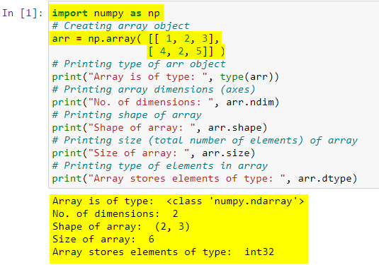
Q4: What is NumPy array and ndarray?
Ans:
- The core component of the NumPy library is the ndarray. ndarray object provides the implementation of n-dimensional arrays of homogeneous data types. ndarray is designed and implemented to accomplish high performance.
- ndarray has several important differences when it’s compared with the standard Python sequences like lists and dictionaries etc.
- NumPy arrays are optimized for advanced mathematical and scientific operations with large data sets. These optimizations in ndarray make it superior to Python’s built-in sequences.
Check Out: Our blog post on Python IDE.
Q5: What are the advantages of Numpy Arrays over Python arrays and lists?
Ans: Below are some main Advantages of the NumPy array:
- NumPy arrays are an alternative for lists and arrays in Python
- Arrays in Numpy are equivalent to lists in python.NumPy arrays can perform some functions that could not be performed when
applied to python arrays due to their heterogeneous nature. - NumPy arrays maintain minimal memory usage as they are treated as objects. Python deletes and creates these objects continually, as per the requirements. Hence, the memory allocation is less as compared to Python lists. NumPy has features to avoid memory wastage in the data buffer.
- NumPy array has support for multi-dimensional arrays. We can also create multi-dimensional arrays in NumPy.These arrays have multiple rows and columns.
- NumPy includes easy-to-use functions for mathematical computations on the array data set. Numpy has many functions and features that make it ideal for Maths operations. There are functions for Linear Algebra, bitwise operations, Fourier transform, arithmetic operations, string operations, etc.
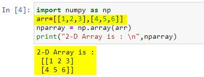
Q6: How do we create 2D Array in NumPy?
Ans: Numpy provides array function that we can use to create a 1-D, 2-D or N-D array in NumPy. Here is an example:
import numpy as np
arr=[[1,2,3],[4,5,6]]
nparray = np.array(arr)
print("2-D Array is : \n",nparray)
Also Read: Our blog post on Python Function.
Pandas
Pandas is defined as an open-source library that provides high-performance data manipulation in Python. The name of Pandas is derived from the word Panel Data, which means Econometrics from Multidimensional data. It can be used for data analysis in Python. It can perform five significant steps that are required for processing and analysis of data irrespective of the origin of the data, i.e., load, manipulate, prepare, model, and analyze.
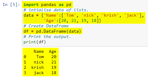
Q7: What Are The Different Types Of Data Structures In Pandas?
Ans: Panda library supports two major types of data structures, DataFrames and Series.
Series is a one-dimensional array that can hold data values of any type (string, float, integer, python objects, etc.). It is the simplest type of data structure in Pandas; here, the data’s axis labels are called the index.

A DataFrame is a 2-dimensional array in which data is aligned in a tabular form with rows and columns. With this structure, you can perform an arithmetic operation on rows and columns.
Also Check: Our blog post on Python Data Types.
Q8: What Are The Most Important Features Of The Pandas Library?
Ans: Important features of the panda’s library are:
- Data Alignment
- Merge and join
- Memory Efficient
- Time series
- Reshaping
Q9: Explain Reindexing in pandas?
Ans: Re-indexing means to conform DataFrame to a new index with optional filling logic, placing NA/NaN in locations having no value in the previous index. It changes the row labels and column labels of a DataFrame.
Q10: List some statistical functions in Python Pandas?
Ans: Some of the statistical functions in Python Pandas are,
- sum() – it returns the sum of the values.
- mean() – returns the mean that is the average of the values.
- std() – returns the standard deviation of the numerical columns.
- min() – returns the minimum value.
- max() – returns the maximum value.
- abs() – returns the absolute value.
- prod() – returns the product of the values.
Also Check: Our blog post on Python Data Visualization.
Q11: How can we sort the DataFrame?
Ans: We can efficiently perform sorting in the DataFrame through different kinds:
- By label
- By Actual value
By label
The DataFrame can be sorted by using the sort_index() method. It can be done by passing the axis arguments and the order of sorting. The sorting is done on row labels in ascending order by default.
By Actual Value
It is another kind through which sorting can be performed in the DataFrame. Like index sorting, sort_values() is a method for sorting the values.
Matplotlib
Matplotlib is a Python plotting library that produces publication quality figures in a variety of hardcopy formats and interactive environments across platforms. Matplotlib can be used in Python scripts, the Python and IPython shells, the Jupyter notebook, web application servers, and four graphical user interface toolkits.
![]()
Q12: What Is Python Matplotlib?
Ans: matplotlib.pyplot is a plotting library used for 2D graphics in a python programming language. It can be used in python scripts, shell, web application servers and other graphical user interface toolkits.
Q13: What is Matplotlib used for?
Ans: Matploitlib is a Python Library used for plotting, this python library provides and objected-oriented APIs for integrating plots into applications.
Q14: Is Matplotlib Included in Python?
Ans: Matplotlib is not a part of the Standard Libraries which is installed by default when Python, there are several toolkits that are available that extend python matplotlib functionality. Some of them are separate downloads, others can be shipped with the matplotlib source code but have external dependencies.
- Basemap: It is a map plotting toolkit with various map projections, coastlines and political boundaries.
- Cartopy: It is a mapping library featuring object-oriented map projection definitions, and arbitrary point, line, polygon and image transformation capabilities.
- Excel tools: Matplotlib provides utilities for exchanging data with Microsoft Excel.
- Mplot3d: It is used for 3-D plots.
- Natgrid: It is an interface to the neat grid library for irregular gridding of spaced data.
Q15: What libraries do data scientists use to plot data in Python?
Ans: Matplotlib is the main library used for plotting data in Python. However, the plots created with this library need lots of fine-tuning to look shiny and professional.
Q16: What are the Types of Plots?
Ans: There are various plots that can be created using python matplotlib. Some of them are listed below:
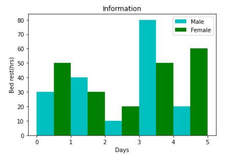
- Bar Graph: The bar graphs are used in data comparison where we can measure the changes over a period of time. It can be represented horizontally or vertically. The longer the bar it has the greater the value it contains.
from matplotlib import pyplot as plt
plt.bar([0.25,1.25,2.25,3.25,4.25],[30,40,10,80,20],label="Male",color="c",width=.5)
plt.bar([0.75,1.75,2.75,3.75,4.75],[50,30,20,50,60],label="Female", color="g",width=.5)
plt.legend()
plt.xlabel("Days")
plt.ylabel("Bed rest(hrs)")
plt.title("Information")
plt.show()
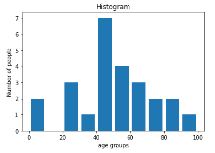
- Histogram Graph: The histogram is used where the data is been distributed while bar graph is used in comparing the two entities. Histograms are preferred during the arrays or data containing the long list.
import matplotlib.pyplot as plt
population_age = [22,55,62,45,21,22,34,42,42,4,2,102,95,85,55,110,120,70,65,55,111,115,80,75,65,54,44,43,42,48]
bins = [0,10,20,30,40,50,60,70,80,90,100]
plt.hist(population_age, bins, histtype="bar", rwidth=0.8)
plt.xlabel("age groups")
plt.ylabel("Number of people")
plt.title("Histogram")
plt.show()
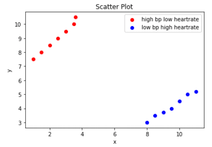
- Scatter Plot: The scatter plots are preferred while comparing the data variables to determine the relationship between dependant and independent variables. The data is displayed as a collection of points, each having the value of one variable which determines the position on the horizontal axis and the value of the other variables determines the position on the vertical axis.
import matplotlib.pyplot as plt
x1 = [1,1.5,2,2.5,3,3.5,3.6]
y1 = [7.5,8,8.5,9,9.5,10,10.5]
x2=[8,8.5,9,9.5,10,10.5,11]
y2=[3,3.5,3.7,4,4.5,5,5.2]
plt.scatter(x1,y1, label="high bp low heartrate",color="r")
plt.scatter(x2,y2,label="low bp high heartrate",color="b")
plt.title("Scatter Plot")
plt.xlabel("x")
plt.ylabel("y")
plt.legend()
plt.show()
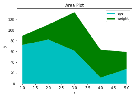
- Area Plot: The area plots were also called stack plots. It is quite similar to the line plots. Area plots are used in tracking the changes over time for two or more related groups that make one whole category.
import matplotlib.pyplot as plt
days = [1,2,3,4,5]
age =[72,82,61,11,27]
weight =[17,28,72,52,32]
plt.plot([],[],color="c", label="age", linewidth=5)
plt.plot([],[],color="g", label="weight", linewidth=5)
plt.stackplot(days,age,weight,colors=["c","g"])
plt.xlabel("x")
plt.ylabel("y")
plt.title("Area Plot")
plt.legend()
plt.show()
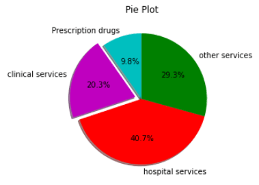
- Pie chart: A pie chart is a circular graph that is divided into segments or slices of pie. It is used to represent the percentage or proportional data where each slice of the pie represents a category.
import matplotlib.pyplot as plt
slices = [12,25,50,36]
activities = ["Prescription drugs","clinical services","hospital services","other services"]
cols = ["c","m","r","g"]
plt.pie(slices,labels=activities,colors=cols,startangle=90,shadow= True,explode=(0,0.1,0,0),autopct="%1.1f%%")
plt.title("Pie Plot")
plt.show()
Check Out: Our blog post on Python Pandas.
Q17: What are the different parts of a plot in matplotlib?
Ans: A Matplotlib plot can be divided into the following parts:
- Figure: The whole figure. The figure keeps track of all the child Axes, a smattering of ‘special’ artists (titles, figure legends, etc), and the canvas.A figure can have any number of Axes, but to be useful should have at least one.
- Axes: This is what you think of as ‘a plot’, it is the region of the image with the data space (marked as the inner blue box). A given figure can contain many Axes, but a given Axes object can only be in one Figure. The Axes contains two (or three in the case of 3D) Axis objects (be aware of the difference between Axes and Axis) which take care of the data limits (the data limits can also be controlled via set via the set_xlim() and set_ylim() Axes methods). Each Axes has a title (set via set_title()), an x-label (set via set_xlabel()), and a y-label set via set_ylabel()).
- Axis: These are the number-line-like objects (circled in green). They take care of setting the graph limits and generating the ticks (the marks on the axis) and tick labels (strings labelling the ticks). The location of the ticks is determined by a Locator object and the tick labels strings are formatted by a Formatter. The combination of the correct Locator and Formatter gives very fine control over the tick locations and labels.
- Artist: Basically everything you can see on the figure is an artist (even the Figure, Axes, and Axis objects). This includes Text objects, Line2D objects, collection objects, Patch objects … (you get the idea). When the figure is rendered, all of the artists are drawn to the canvas. Most Artists are tied to an Axes; such an Artist cannot be shared by multiple Axes or moved from one to another.
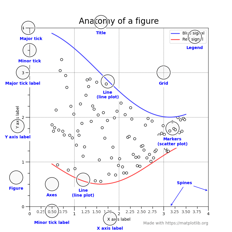 Source: Matplotlib
Plotly
Python Plotly Library is an open-source library that can be used for data visualization and understanding data simply and easily. Plotly supports various types of plots like line charts, scatter plots, histograms, cox plots, etc. So you all must be wondering why Plotly over other visualization tools or libraries? Here’s the answer –
- Plotly has hover tool capabilities that allow us to detect any outliers or anomalies in a large number of data points.
- It is visually attractive that can be accepted by a wide range of audiences.
- It allows us for the endless customization of our graphs that makes our plot more meaningful and understandable for others.
Q18: Why do we use Plotly?
Ans: Plotly has got some amazing features that make it better than other graphing libraries:
- It is interactive by default
- Charts are not saved as images but serialized as JSON, making them open to be read with R, MATLAB, Julia and others easily
- Exports vector for print/publication
- Easy to manipulate/embed on web
Q19: What are the Types of Plots?
Ans: There are various plots that can be created using python matplotlib. Some of them are listed below:
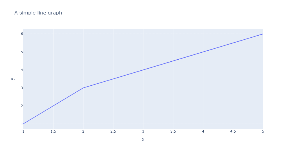
- Line Chart: Line plot in Plotly is much accessible and illustrious annexation to plotly which manage a variety of types of data and assemble easy-to-style statistic. With px.line each data position is represented as a vertex transformed of a polyline mark in 2D space. Line chart Displays a series of numerical data as points which are connected by lines. It visualizes to show two data trends.
import plotly.express as px
x = [1,2,3,4,5]
y = [1,3,4,5,6]
fig = px.line( x = x ,
y = y,
title = 'A simple line graph')
fig.show()
- Bar Chart: In a bar chart the data categories are displayed on the vertical axis and the data values are displayed on the horizontal axis. Labels are easier to display and with a big data set they impel to work better in a narrow layout such as mobile view.
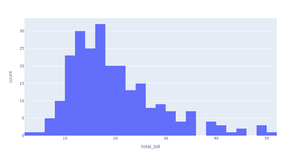
- Histogram graph: A histogram is a graph where the data are stocked and the each stocked is counted and represented. More broadly, in plotly a histogram is an accumulated bar chart, with several possible accumulation functions. The data to be stocked can be numerical data but also categorical or date data. It is commonly used in dealing with large data of sets.
import plotly.express as px
df = px.data.tips()
fig = px.histogram(df, x="total_bill")
fig.show()
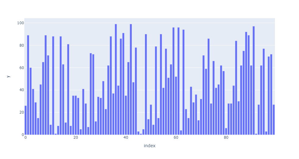
- Scatter Plot: A scatter plot is a diagram where each value is represented by the dot graph. Scatter plot needs arrays for the same length, one for the value of x-axis and other value for the y-axis. Each data is represented as a dot point, whose location is given by x and y columns. It can be created using the scatter() method of plotly.express.
import plotly.express as px
import numpy as np
# creating random data through randomint
# function of numpy.random
np.random.seed(42)
random_x= np.random.randint(1,101,100)
random_y= np.random.randint(1,101,100)
plot = px.scatter(random_x, random_y)
plot.show()

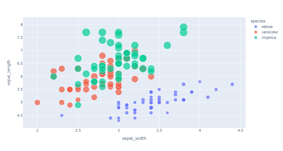
- Bubble Chart: The bubble chart in Plotly is created using the scatter plot. It can be created using the scatter() method of
plotly.express. A bubble chart is a data visualization which helps to displays multiple circles (bubbles) in a two-dimensional plot as same in scatter plot. A bubble chart is primarily used to depict and show relationships between numeric variables.
import plotly.express as px

df = px.data.iris()

fig = px.scatter(df, x="sepal_width", y="sepal_length",
color="species",
size='petal_length',
hover_data=['petal_width'])
fig.show()
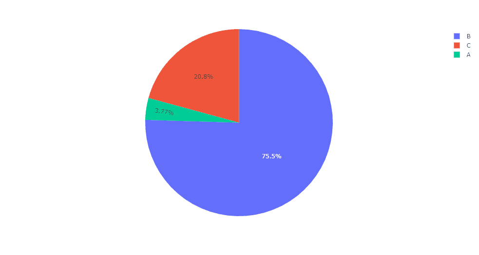
- Pie Chart: A pie chart is a circular analytical chart, which is divided into region to symbolize numerical percentage. In px.pie, data anticipated by the sectors of the pie to set the values. All sector are classify in names. Pie chart is used usually to show the percentage with next corresponding slice of pie.
import plotly.express as px
import numpy as np
# Random Data
random_x = [100, 2000, 550]
names = ['A', 'B', 'C']
fig = px.pie(values=random_x, names=names)
fig.show()
Q20: Differnce between Matplotlib and Plotly?
Ans: Matplotlib is quite possibly the simplest way to plot data in Python. It is similar to plotting in MATLAB, allowing users full control over fonts, line styles, colors, and axes properties. This allows for complete customization and fine control over the aesthetics of each plot, albeit with a lot of additional lines of code. There are many third-party packages that extend the functionality of matplotlib such as Basemap and Cartopy, which are ideal for plotting geospatial and map-like data.
Plotly is another great Python visualization tool that’s capable of handling geographical, scientific, statistical, and financial data. The company behind Plotly, also known as Plotly, makes an entire suite of visualization tools for multiple programming languages, all of which create interactive web-based visualizations and even web applications. Plotly has several advantages over matplotlib.
To summarize, matplotlib is a quick and straightforward tool for creating visualizations within Python. Plotly, on the other hand, is a more sophisticated data visualization tool that is better suited for creating elaborate plots more efficiently.
Related References
- Python Methods and Functions Q & A: Day 3 Live Session Review
- Python OOPs Concepts, Error And Exception Handling Q & A: Day 4 Live Session Review
- Introduction to Artificial Neural Network in Python
- Natural Language Processing with Python
- Python For Data Science: Why, How & Libraries Used
- Python For Beginners: Overview, Features & Career Opportunities
Next Task For You…
Python’s growth is very promising in the near future. Gaining the right skills through the right platform will get you to the perfect job.
We are launching our course Python For Data Science (AI/ML) & Data Engineers (Python For Beginners) which will you help and guide you towards your first steps to Python. Join our FREE CLASS to know more about it.


![AWS DevOps [DOP-C02] Professional Step By Step Activity Guides (Hands-On Labs)](https://k21academy.com/wp-content/uploads/2023/02/DOP-C02-1.png)