


![]()
If you are a data practitioner, you would’ve come across situations where you need to explain your data to someone else. You need to tell a story, get your point across and convince maybe your colleague, supervisor, or even your CEO. So how do you do it?!
In today’s world, every second the data keeps on getting bigger and bigger. In order to understand the data quickly and to draw insights, data visualization becomes necessary.
In this blog, we are going to cover how we can do data visualization using Plotly which is Python’s visualization library to visualize data in the form of graphs and charts.
What is Data Visualization?
You all must have heard a very common saying that “a picture is worth a thousand words“.
In data science, visual presentation of the data is a first-class citizen. We combine together various charts to better understand the data and the relationships it hides.
Data Visualization is the technique to represent the data/information in a pictorial or graphical format that enables stakeholders and decision-makers to analyze and explore data visually and uncover deep insights.
“Visualization gives you answers to questions you didn’t know you had.” – Ben Schneiderman
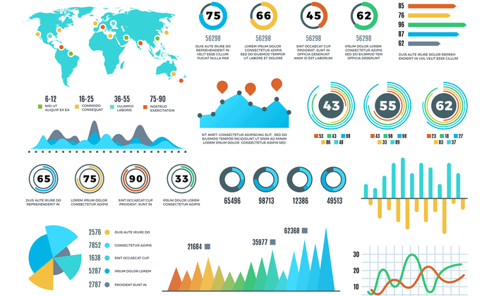
For e.g. consider a case where you are asked to illustrate crucial sales aspects (like sales performance, target, revenue, acquisition cost, etc.) from huge amounts of sales data, which one would you prefer:
- Exploring the data using Excel (or spreadsheets) and keeping track of each sales aspect manually.
- Exploring the data using different types of sales graphs and charts
Obviously, you would prefer graphs and charts. So data visualization plays a key role in data exploration and data analysis.
Benefits of Data Visualization
- Helps in data analysis, data exploration and makes the data more understandable.
- Summarises the complex quantitative information in a small space.
- Helps in discovering the latest trends, hidden patterns in the data.
- Identifies the relationships/correlations between the variables.
- Helps in examining the areas that need attention or improvement
Check Out: Our blog post on Data Science Roadmap.
Introduction To Plotly
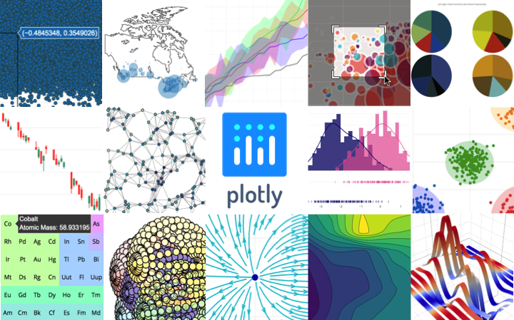
Plotly is an open-source library that provides a whole set of chart types as well as tools to create dynamic dashboards. You can think of Plotly as a suite of tools as it integrates or extends with libraries such as Dash or Chart Studio to provide interactive dashboards. Plotly’s Python graphing library makes interactive, publication-quality graphs.
Plotly supports dynamic charts and animations as a first principle and this is the main difference between other visualization libraries like matplotlib or seaborn.
Main Properties of Plotly:
- It can be used with other languages such as R, Python, Java.
- No JavaScript knowledge is required at all. You code Plotly in your choice of supported languages.
- Each Plotly visual is a JSON object. In this way, the visual can be accessed and used in different programming languages.
- With Plotly you can also build dynamic dashboards using Dash extension.
- Chart Studio allows you to create and update the graphics you want without any coding. It has a very simple and useful interface. It is especially useful in areas such as business intelligence.
- Plotly allows you to view the entire dataset in the same figure which is very important for the user experience.
- Transforming Matplotlib charts to Plotly charts is supported.
- Plotly has been added to the Pandas plotting backend with the new version of Pandas. So we can make plotting on Pandas without having to import Plotly Express.
Check Out: Our blog post on Python Data Types.
Basic Charts
We can create the following types of chart while performing data visualization using Plotly:
- All Matplotlib and Seaborn Charts
- Statistical Charts
- Scientific Charts
- Financial Charts
- Geological Maps and 3 Dimensional Plots which allows you to interact with them

Source: Google
1.) Line chart
It is one of the simple plots where a line is drawn to shoe relation between the X-axis and Y-axis. It can be created using the px.line() method with each data position is represented as a vertex (which location is given by the x and y columns) of a polyline mark in 2D space.
2.) Bar Chart
A bar chart is a pictorial representation of data that presents categorical data with rectangular bars with heights or lengths proportional to the values that they represent. In other words, it is the pictorial representation of the dataset. These data sets contain the numerical values of variables that represent the length or height. It can be created using the px.bar() method.
3.) Scatter Plot
A scatter plot is a set of dotted points to represent individual pieces of data in the horizontal and vertical axis. A graph in which the values of two variables are plotted along X-axis and Y-axis, the pattern of the resulting points reveals a correlation between them. it can be created using the px.scatter() method.
4.)Histogram
A histogram is basically used to represent data in the form of some groups. It is a type of bar plot where the X-axis represents the bin ranges while the Y-axis gives information about frequency. It can be created using the px.histogram() method.
5.) Pie Chart
A pie chart is a circular statistical graphic, which is divided into slices to illustrate numerical proportions. It depicts a special chart that uses “pie slices”, where each sector shows the relative sizes of data. A circular chart cuts in a form of radii into segments describing relative frequencies or magnitude also known as a circle graph. It can be created using the px.pie() method.
6.) Box Plot
A Box Plot is also known as a Whisker plot created to display the summary of the set of data values having properties like minimum, first quartile, median, third quartile, and maximum. A box is created from the first quartile to the third quartile and a verticle line is also there which goes through the box at the median. Here x-axis denotes the data to be plotted while the y-axis shows the frequency distribution. It can be created using the px.box() method
7.) Violin Plot
Violin Plot is a method to visualize the distribution of numerical data of different variables. It is similar to Box Plot but with a rotated plot on each side, giving more information about the density estimate on the y-axis. The advantage of a violin plot is that it can show nuances in the distribution that aren’t perceptible in a boxplot.
8.) 3D Scatter Plot
3D Scatter Plot can plot 2D graphics that can be enhanced by mapping up to three additional variables while using the semantics of hue, size, and style parameters. All the parameter control visual semantic are used to identify the different subsets.
There are formats also to present data like creating heatmaps, waterfall charts, maps, etc which can be executed using simple python commands. You can check the complete guide here.
Read More: About Python Control Statements.
Getting Started with Data Visualization Using Plotly
To create interactive visualizations you first have to install the Plotly package in the working environment.
Install the package
To install the package run the below command in the terminal or in the Jupyter notebook.
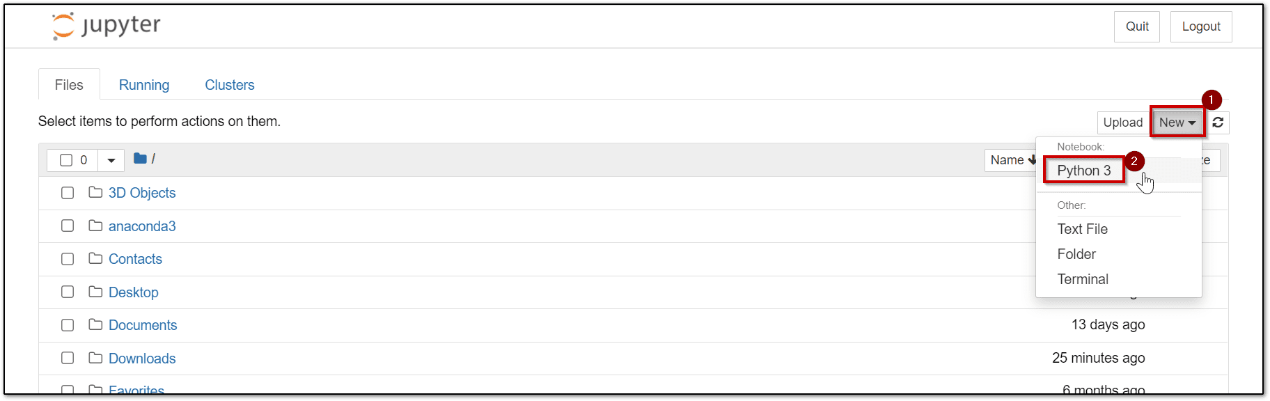
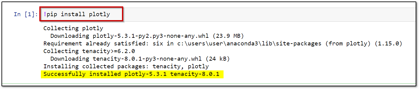
Step 1: Open Jupyter Notebook
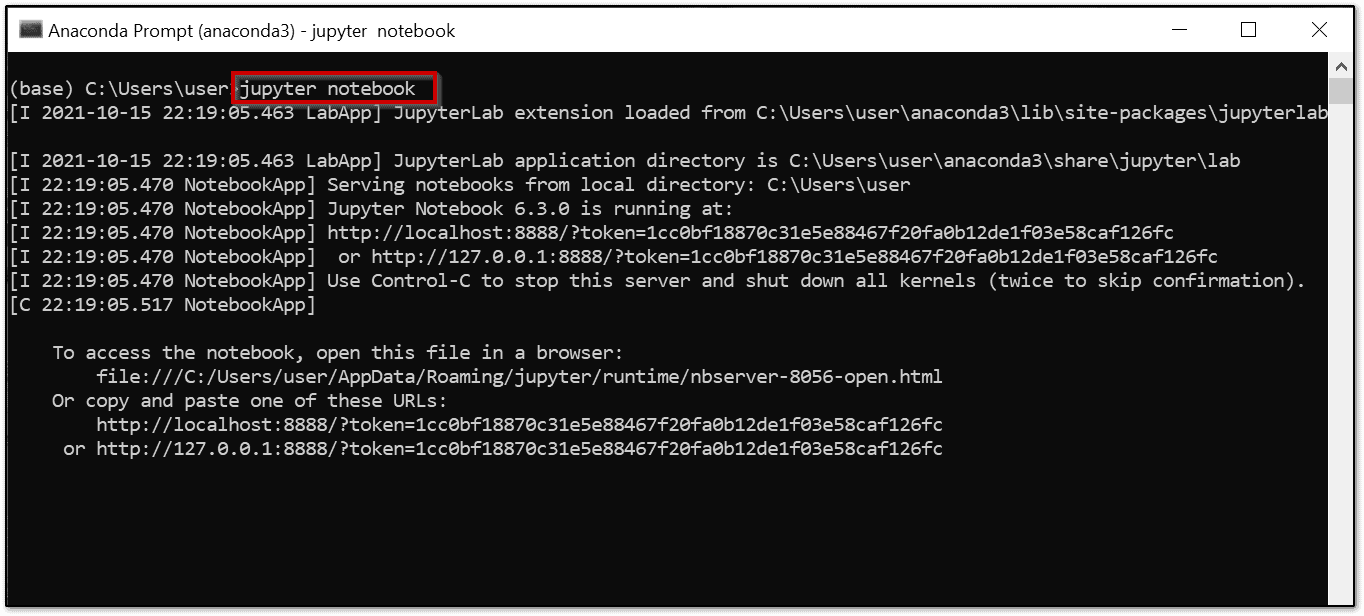
Step 2: In the Jupyter Notebook, create a new python file.
Step 3: In the notebook run the below command.
!pip install plotly
Note: It might take a few minutes for the command to successfully execute.
Now that Plotly is installed in our coding environment, we can use it. But we will have to import the package initially to start with the visualizations.
Basic Architecture of the Plotly Library
The Plotly library has the following modules:
- Graph_objs (plotly. graphs_objs): It is the module that contains the objects or shape templates used to visualize.
- Plotly Express(plotly.express): Plotly Express is the high-level API of Plotly and it’s much easier to draw charts with this module.
- Subplots(make_subplots): This module contains the helper functions for layouts of the multi-plot figures. Figures with predefined subplots configured in ‘layout’.
- Figure Factories(plotly.figure_factory): This module provides many special types of figures such that drawing these in Plotly or Plotly Express is quite difficult.
- I/O: This module is the low-level interface for displaying, reading, and writing figures for static images, JSON, HTML and etc.
Data Visualization Using Plotly Example
Let’s take a sample dataset (taken from Open Source) and create a line chart, bar graph, histogram, etc from the data.
Step 1: Make Sure you have installed the Plotly package, if not then run the command to install the required library.

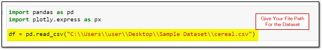
Step 2: Import the required packages and dataset.
Note: In this demo, the Cereal dataset is being used. You can download the dataset from Kaggle on your laptop.
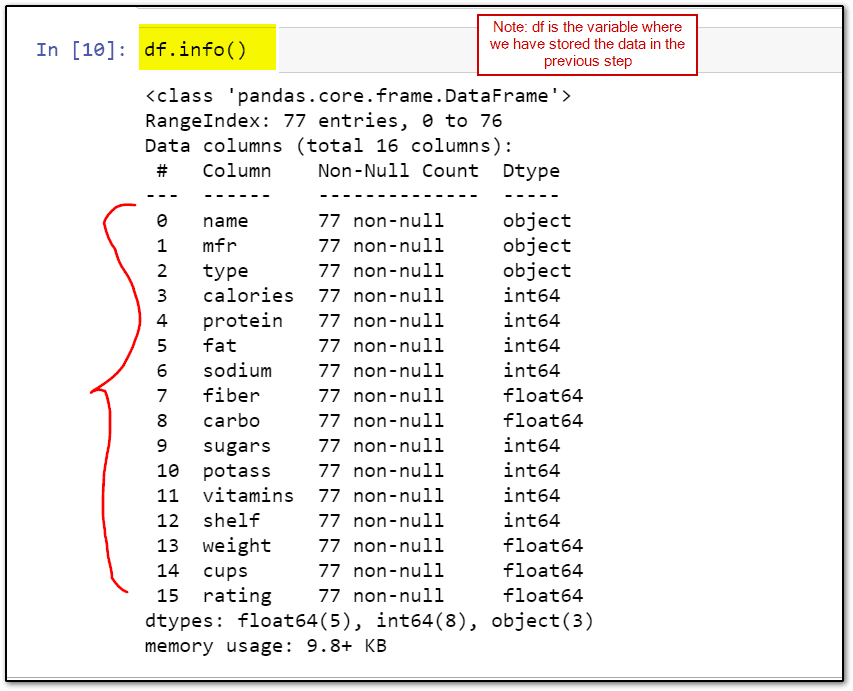
Step 3: You can view the dataset headers (column names) by running the following command.
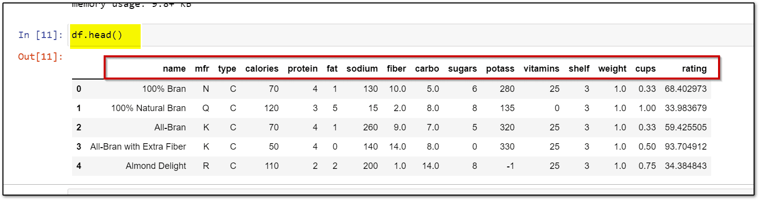
Step 4: To view the entries of the dataset run the df.head() command.
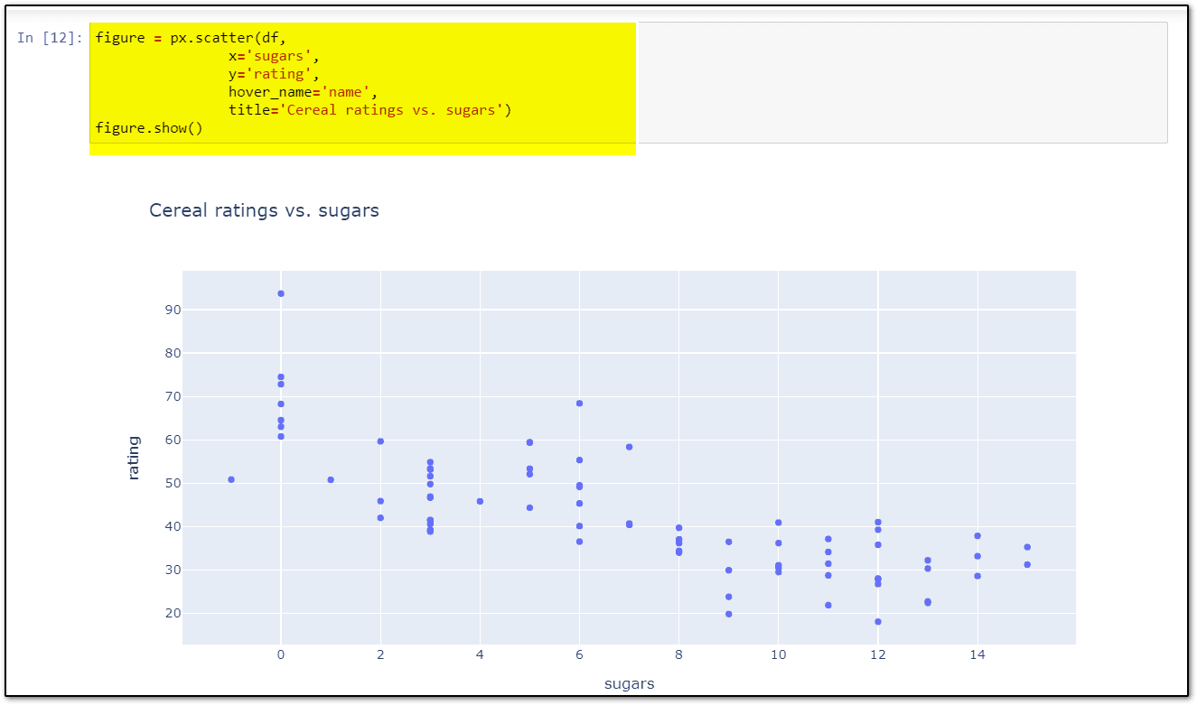
Step 5: Let’s look at the relationships between the rating and sugars and include the cereal name as a hover label. Run the below command to do so
figure = px.scatter(df,
                x='sugars',
                y='rating',
                hover_name='name',
                title='Cereal ratings vs. sugars')
figure.show()
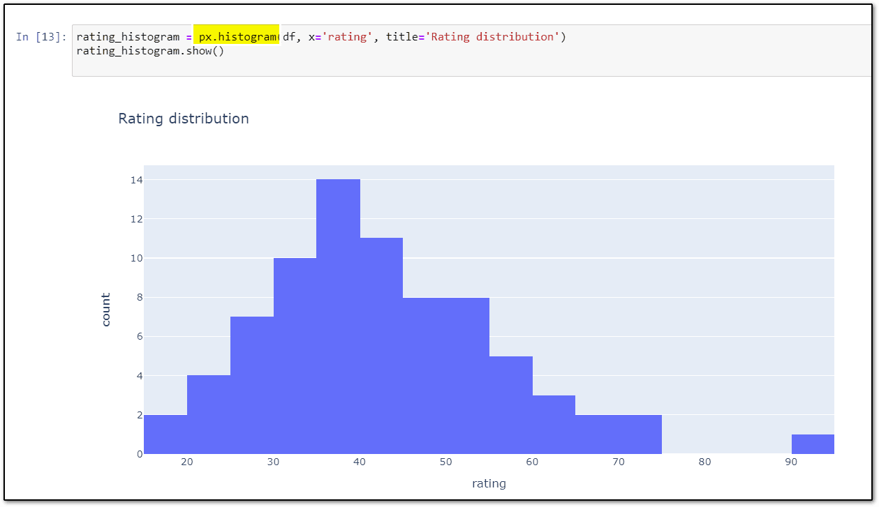
Step 6: Create a static histogram image for the rating distribution.
fig = px.histogram(df, x='rating', title='Rating distribution')
fig.show()
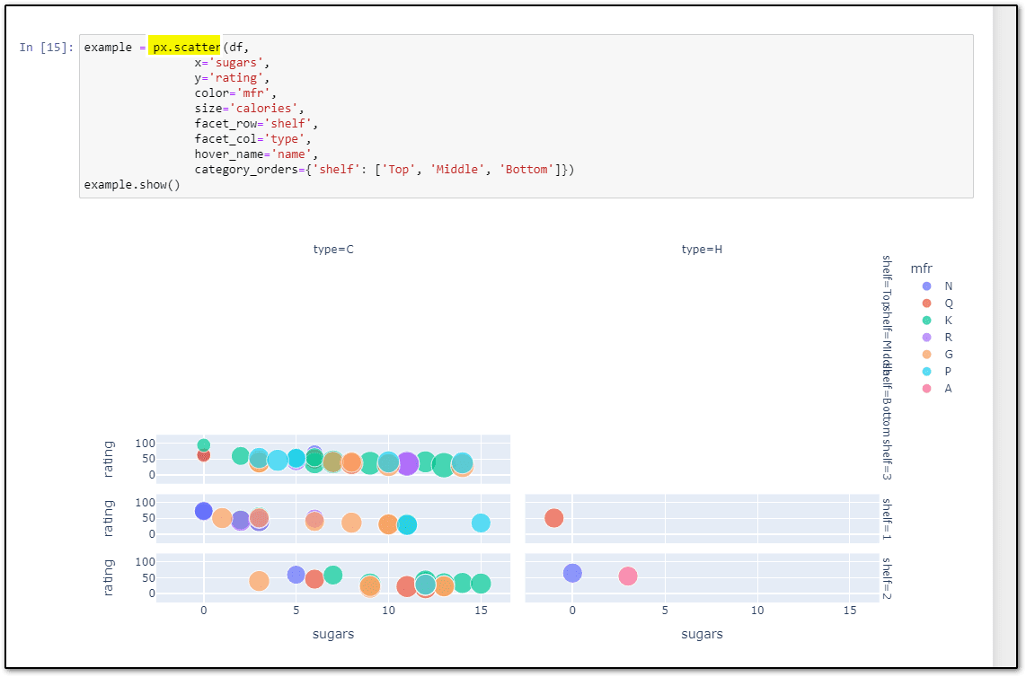
Step 7: In addition to the different chart types, most types support the same basic function signature so you can easily facet the data or change colors or sizes based on the values in your DataFrame using the below code.
fig = px.scatter(df,
                x='sugars',
                y='rating',
                color='mfr',
                size='calories',
                facet_row='shelf',
                facet_col='type',
                hover_name='name',
                category_orders={'shelf': ['Top', 'Middle', 'Bottom']})
fig.show()
This was just an example of how you can create scatter plots, histograms, etc using simple python commands and Plotly for data visualization purposes. Similarly, you can create some advanced and visual funnel charts, treemaps, geographical maps, etc to perform data visualization using Plotly.
Related References
- Python For Beginners: Overview, Features & Career Opportunities
- An Introduction To Python For Microsoft Azure Data Scientist | DP-100
- Python For Data Science: Why, How & Libraries Used
- Data Scientists vs Data Engineers vs Data Analyst
Next Task For You…
Python’s growth is very promising in the near future. Gaining the right skills through the right platform will get you to the perfect job.
We are launching our course Python For Data Science (AI/ML) & Data Engineers (Python For Beginners) which will you help and guide you towards your first steps to Python. Join our FREE CLASS to know more about it.


![AWS DevOps [DOP-C02] Professional Step By Step Activity Guides (Hands-On Labs)](https://k21academy.com/wp-content/uploads/2023/02/DOP-C02-1.png)