![]()
On Day 7, we also covered hands-on Lab 9, Lab 10 out of our 11 hands-on labs. We learned how to Pin visuals to a dashboard, Configure a dashboard tile alert, Use Power BI Report Builder, Design a multi-page report layout, and many more.
On Day 6 Session, we covered an overview of Optimize a Model for Performance in Power BI.
A week before, on Day 5 Session, we covered an overview of Create Reports in Power BI.
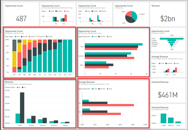
- Microsoft Power BI dashboards are different from Power BI reports. Dashboards allow report consumers to create the single artifact of the directed data personalized just for them.
- Dashboards are comprised of pinned visuals that are taken from the different reports.
- PowerBI report uses data from a single dataset; a PowerBI dashboard can contain visuals from different datasets.
- Power BI dashboards are a feature that is only included in the Power BI service. And also, you can view dashboards on mobile devices, though you can’t build them there.
- The below image is an example of Dashboards.
Also Check: Power bi vs MSBI, Know their major differences!
> Configure Data Alerts
Configuring the data alerts is a simple process to complete on a dashboard in PowerBI. We can use Data Alerts to notify you or a user that a specific data point is below, above, or at a specific threshold that you can set.
- These alert features are only available on the PowerBI service, and they are available on such report elements as KPI visuals, cards, and gauges.

- Selecting the +Add alert rule will add the new alert.
- Check that the Active toggle switch is turned On and name the alert, and set the condition.
- You can choose a threshold that you want to create the alert for, including options for Below or Above a specific threshold.
Also Check: Our blog post on Power bi slicer
> Q&A feature
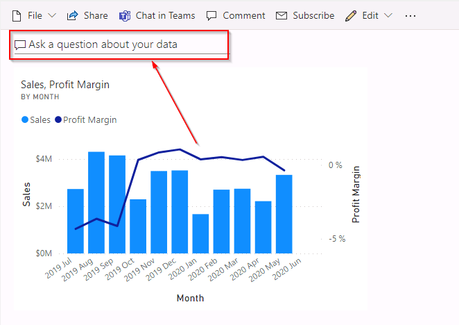
- The Q&A feature is the tool within PowerBI Desktop that allows asking the natural language questions about the data.
- To locate a Q&A feature, go to the dashboard in the Power BI service. Along with the top ribbon is the Ask a question about your data search box.
The Q&A visual has three elements:
- Question box – The user can enter their question about the data. An example of a question could be: What was the average sales amount by category? Entering this question will trigger PowerBI’s natural language analysis engine to determine and parse the appropriate data to display.
- Pre-populated suggestion tiles – This element contains tiles with pre-populated suggestions for questions the user can consider. When the user selects one of the tiles, they will show analysis. For example, when you select the top product category named by march sales tile, you get the following visual when you convert the Q&A visual.
- Pin visual- Selecting the pin visual icon will allow you to pin the visual onto a new or existing dashboard
![]()
Also Check: Our blog post on Power bi Table Visualization.
> Pin a Live Page
- When we pin a visual, we can add it to an existing or a new dashboard.
- We can do the same with entire reports; when we pin a report page, all the visuals on a report will be pinned to a dashboard, and they are also live, which means that any change you make on the report will be immediately reflected on the dashboard that we have pinned the report to.
- Pinning a live page is the simple way to pin all the visuals at once so that we don’t have to do any reformatting on the dashboard.
- To pin a live page, select the ellipsis (…) on the navigation bar of the report and then select Pin to a dashboard.
- After selecting Pin life, you will be redirected to a new window to see your dashboard. On the dashboard, you can modify the visuals as needed.

Also Check: How to use Power bi Service.
> Stream in Power BI
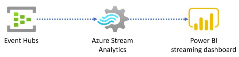
- Streaming data can come from various sources, including social media, factory sensors, service usage metrics, and other sources containing a constant stream of data points.
- Sensors on the machines constantly send the stream of telemetry data to the Housed in their native, IoT hub, messy format.
- From the IoT hub, you can use the stream insight job to aggregate data, meaning that it will quiet the noisy messages and clean the data.
- After that, you can retrieve the data into PowerBI as the streaming dataset to build the pertinent visuals and consume the information.
- Data from a streaming dataset isn’t stored in a Power BI data model; instead, it’s stored in the temporary cache. Consequently, you cannot model data with this type of dataset.
- The only way to visualize data from the streaming data source is to create a tile directly on the dashboard and use a custom streaming data source.
To know more about Streaming Data in Power BI Click here
> Mobile view
- Power BI reports are built-in Power BI Desktop and then deployed to Power BI service to be viewed and shared.
- If you are building the dashboards for a Sales team at your organization and you receive the requirement that the dashboards should also be viewable on mobile devices, Power BI will help you set dashboards to mobile view.
- In the mobile view in PowerBI Desktop, you can accomplish several tasks. This emulates the view of a user looking at the visuals on their phone so that you can add the visuals to this view, resize them, and change the formatting on them, as shown in the ensuing screenshot.
- After you have published to PowerBI service, you can view the visuals on a mobile device. You can also optimize your dashboards for mobile view in the Power BI service.

Source: Microsoft
Also Check: What is Power Query?
> Paginated Reports
- Paginated reports allow the report developers to create PowerBI artifacts that have tightly controlled rendering requirements.
- Paginated reports are ideal for receipts, creating sales invoices, purchase orders, and tabular data.
- Paginated reports give a pixel perfect view of the data. Pixel perfect means that you have control of how reports render.
- If you want the footer on every sales receipt you create, a paginated report is appropriate. If you want a particular customer’s name to appear in green font on a report, you can do it with the paginated reports.
- PowerBI paginated reports are descendants of SQL Server Reporting Services (SSRS). PowerBI paginated reports and SSRS have a lot in common.
- The below image is an example of Paginated Reports.

Q/A asked during the session
Q1.What is a dashboard?
A: A canvas of report elements that can be built-in Power BI service.
Q2.How do Dashboards differ from Reports?
A: The Difference between Dashboards and Reports are as follows:
- Dashboards can be created from reports and multiple datasets.
- Dashboards do not have the Visualization, Filter, and Fields panes in PowerBI Desktop, meaning that you cannot add new slicers and filters, and you cannot make edits.
- Reports can be multiple pages, but Dashboards can only be a single page
- You cannot see the underlying dataset directly in a dashboard, but you can see the dataset in the report under the Data tab in PowerBI Desktop.
- Both reports and dashboards can be refreshed to show the latest data.
Q3.What is the use of Data alerts?
A: Data alerts can be used to notify you or a user that a specific data point is below, above, or at a specific threshold that you can set.
Q4.What to create to visualize the streaming data?
A: To visualize streaming data, you need to create a new tile directly on an existing or new dashboard.
Q5.When are paginated reports used?
A: You can use paginated reports for operational reports with tables of details and optional headers and footers. And also, when you want an e-receipt, a purchase order, it can be used when you expect to print the report on paper, or an invoice.
Q6.Why are parameters important in Power BI paginated reports?
A: They allow the user to control how the report is rendered when the report is run. And also, parameters can be used in the report dataset, the report design surface, and other places. Users insert values into the available parameters, and the report author uses those values in the appropriate location in the report.
Q7.Which tool is used for creating Paginated reports?
A: They are only built by using the Power BI Report Builder.
Q8.What is the process of Getting data into paginated reports?
A: The first step in creating a report is to get data from a data source
- Getting data in a PowerBI paginated report does not involve data cleaning steps.
- According to the query, data is not stored in a PowerBI paginated report dataset. When the data is refreshed on the report, it is retrieved in an unaltered form from the data source used to retrieve it.
- Data can collect from multiple data sources, including Oracle, Microsoft Excel, SQL Server, and many more.
Quiz Time (Sample Exam Questions)
With our Microsoft Data Analyst Associate, we cover Over 100+ Sample questions to help you prepare for the Certification [DA-100]
Check out these Questions:
Comment your answer in the comment box.
References
- Microsoft Certified Data Analyst Associate [DA100]: Everything You Need To Know
- Microsoft Certified Data Analyst Associate [DA100] Step By Step Activity Guides (Hands-On Labs)
- Case Study: Display Live Data Streaming Using Power BI Service
Next Steps to begin with DA100 Certification:
Our Microsoft Data Analyst Associate Training Program will cover all the exam objectives, 11 Hands-On Labs, and practice tests if you want to begin your journey towards becoming a Microsoft Certified: Data Analyst Associate [DA-100] by checking our FREE CLASS.


Leave a Reply